The client needed 8 sets of titles ready to use in Final Cut Pro, as easy as possible, to just type down a single word, a sentence, a question, a paragraph or multiple paragraphs and don’t need to struggle with adjusting the position, background etc.
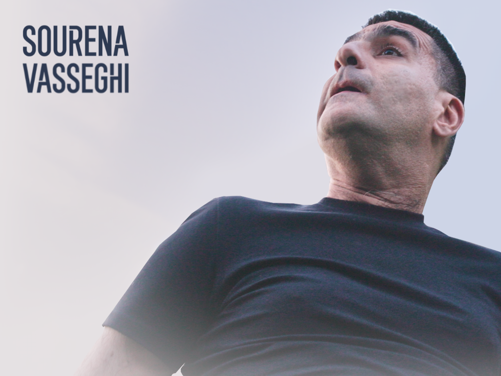
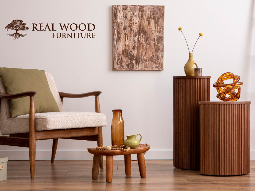
The client provided two images they wanted to use as backgrounds in their titles. They also provided their brand guideline, the name of the font they wanted to use and an animation they wanted me to look at as a sample of the final product. The titles were to be used in Final Cut Pro, so I had to use Apple Motion to design and animate them.
Simplicity was the #1 priority for my client. So Instead of 8 different titles (4 different font settings with 2 pictures), I created 2 titles for them each with one of the pictures provided. Then I setup the title in a way that the text would be automatically adjusted in its box. The longer the text, the smaller the text would be. Yet, since it’s a full page design, the text is still very easy to read! They LOVED it!